ALEX HYSEL

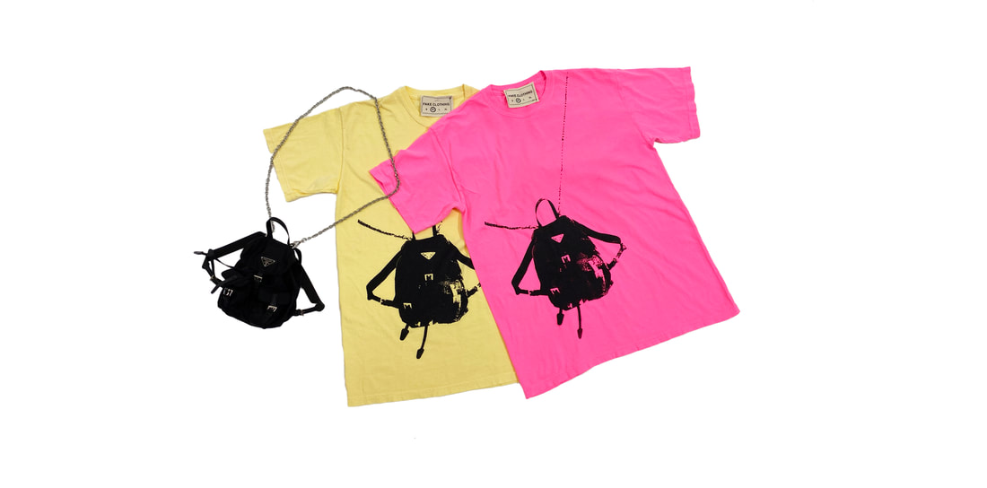
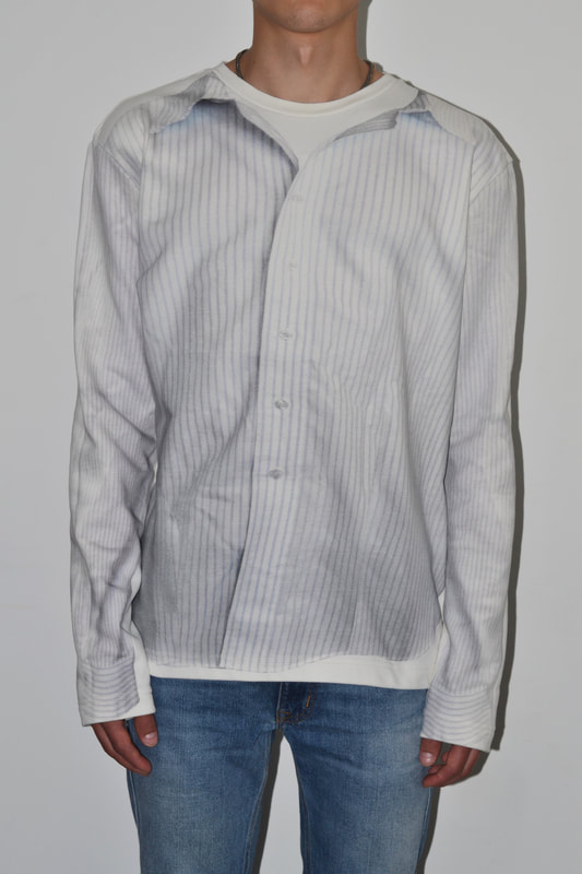
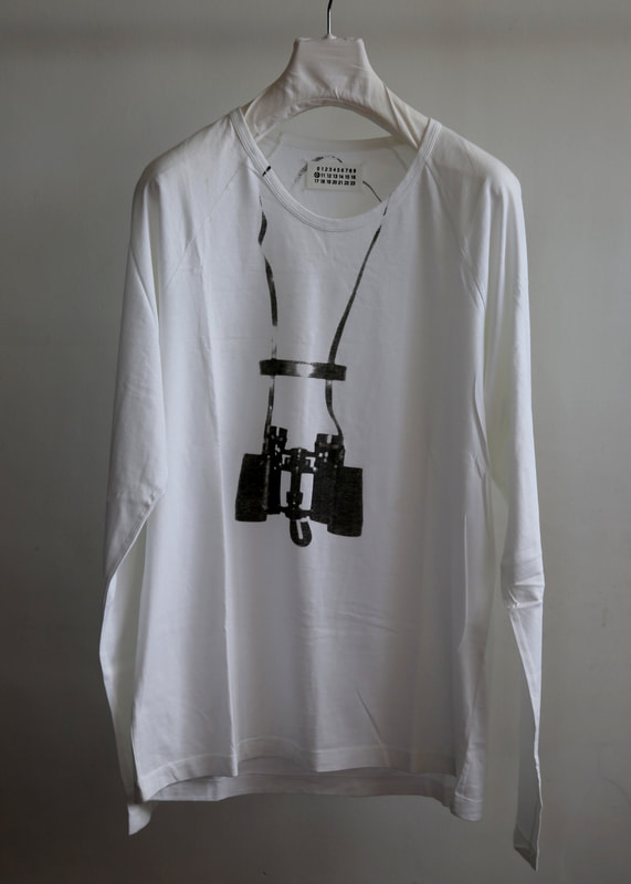
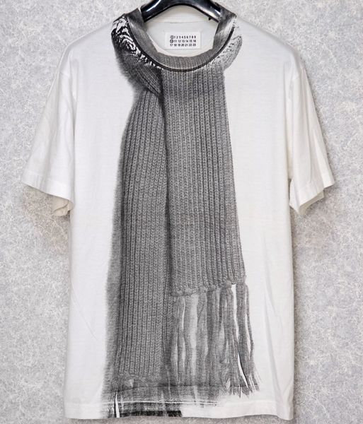
DIARY OF A JAWNZ ENTHUSIAST

Sometime around 2013, I  discovered something that would change my life forever. Once I discovered jawnz, I never looked back. This blog is a collection of my thoughts on clothing, my relationship to clothes, and the interaction between clothing and the rest of the world. ​
  • HOME
  • fake clothing
  • ARCHIVE
  • About

2/23/2021

On my favorite project to date

1 Comment

Read Now
 
​this project has been a long time coming. long before i started working for august, i approached the owner about selling my designs in the store. (i just looked it up in my dm's and it was jan. 25, 2018, so it was really in the first days of the fake clothing brand concept and just a few months after august opened its doors.) 5 days later, I got a polite no, along with an explanation that they were focusing on their in-house label and evolving their established-brands list. fast forward 3 years, and i am beyond proud to be the first designer to be featured under the newest august brand banner - august homegrown.

the most poetic part of this is how much has changed but yet how much has stayed the same. (shoutout bon jovi). upon looking up my brand pitch to rob, i found that my definition at the time was that fake clothing was "a play on what is real and what is fake, especially considering a connection between clothing [and] art." despite my ideas for the brand evolving considerably since 2018, eerily, my description was very much the same for the launch of homegrown : : 001: "the brand's mission is to bridge the gap between consumer fashion and fine art, and investigate the relationship between ‘real’ and ‘fake’." unsurprisingly, my verbiage is a bit more polished but is essentially saying the same thing.

a similar thing can also be said for august. so much has changed since 2018. in early 2021 we are in a way entering a third evolution of the store and the brand. so many successes have been had and august has made innumerable friends along the way, but we are still working on building out the august brand. 2021 is arguably the biggest year already for august merch. and homegrown is just one of at least 3 sub banners that have opened since i first pitched selling items in the store. yet with the launch of this banner, in very much the same way my 2021 description of 'fake' directly paralleled my 2018 one, august homegrown realizes a core original goal of august of "
welcom[ing] all members of our community to share in the exchange of ideas, art and fashion."

in ways no one in 2018 could have conceived, august and myself have grown together to realize a mutually beneficial relationship. august is now in a place to support and promote local designers. i am now in a place of actually putting my ideas into production and really fleshing out what "fake clothing" looks like. i really believe that this joint effort will be the start of something truly great and meaningful for both of us.

i hope featuring myself as the first "homegrown" designer isn't a bad look. i didn't make this project such a priority for solely selfish the purpose of making myself a little extra money on the side. i wanted to spearhead this project to give people like myself the platform to grow their brand and audience. that is because i see every day what august means to people the people in the madison streetwear/fashion community. i have met so many young designers that look to august as a beacon of light just like i did back in 2018 (and still do). so many young designers that deserve to have their ideas amplified and legitimated by an established purveyor of streetwear.  i look forward to curating those designs from folks i am proud to call friends, and finding more people out there who share in my (and august's) vision. 

Share

1 Comment

1/26/2021

On the tee about nothing

1 Comment

Read Now
 
Picture
seinfeld is the greatest show of all time. sorry, sopranos, breaking bad, the wire, etc. fans out there, but this is just a fact. YOU SIMPLY CAN'T ARGUE WITH NUMBERS AND AS THE T-SHIRT SAYS, SEINFELD WAS THE #1 SHOW ON TV WHEN IT ENDED, PULLING IN 75 MILLION VIEWERS RIGHT TO THE END. rather than CATERING TO the much-loved category of "prestige tv", seinfeld mastered the tried and true genre of the sitcom. many others have come before and since, but none truly mastered the domain the waY larry david, seinfeld and the gang mastered the zeitgeist of 90's new york.

the show about nothing was more than just an encapsulation of its time period. it brought sharp commentary on the the minutiae of daily life-no matter the setting. you didn't have to be from new york to understand the frustration of waiting for a table when you're starving and trying to make a movie. that's what made seinfeld so well-received IN its time and even in the decades to follow. its content is perennially relatable. it didn't MATTER to me that the show had been off the air for going on 2o years when I first started WATCHING; i still found it endlessly hilarious. but perhaps its strongest attribute is that I still find it hilarious even after watching the whole series at least a half dozen times.
ONE OF MY FAVORITE PARTS OF THE SHOW - OTHER THAN THE WHOLE THING, AND TIMELESS EPISODES LIKE 'THE SOUP NAZI' AND 'THE CONTEST' - HAS ALWAYS BEEN ITS INNUMERABLE REFERENCES TO CLOTHING AND TEXTILES. THERE WERE THE OUTRAGEOUS ONES LIKE THE TECHNICOLOR DREAMCOAT AND THE TIME KRAMER TRIED TO DESTROY A WASHING MACHINE WITH CEMENT, BECAUSE JERRY THOUGHT THE GUY AT THE LAUNDROMAT HAD STOLEN FROM HIM. THEN THERE WERE THE MORE SUBTLE ONES, LIKE JERRY'S SUEDE BOMBER THAT COST A STRIKINGLY EXORBITANT AMOUNT AND THE SO-CALLED "GOLDEN BOY", JERRY'S MUCH-BELOVED WORKHORSE T-SHIRT THAT HAD BEEN THROUGH COUNTLESS WASH-SPIN-RINSE-SPIN CYCLES, BEFORE BEGINNING TO FRAY. THERE ARE VIRTUALLY COUNTLESS EXAMPLES OF REFERENCES AND THAT CAN BE A DIARY ENTRY FOR ANOTHER DAY. THIS ENTRY IS ABOUT THE FAKE CLOTHING SEINFELD TRIBUTE TEE.

I HAVE BEEN MEANING FOR OVER A YEAR TO DO SOMETHING SEINFELD RELATED, BUT I COULD NEVER SETTLE ON THE RIGHT WAY TO DO IT. I MADE LOGO FLIPS OF ALL THE VARIETIES OF THE CLASSIC SEINFELD LOGO, BUT I NEEDED MORE THAN THAT. I THOUGHT MAYBE THEY WOULD ALL EXIST ON THEIR OWN TEE, WITH ADDITIONS TO EACH ONE, WHICH WOULDN'T BE A BAD IDEA IF I HAD A LARGER MARKET TO SELL TO. BUT, ALAS, MY RADIUS IS STILL SMALL, SO I THOUGHT IT BEST TO JUST MAKE ONE. THEN, JUST RECENTLY, WHEN LARRY KING DIED (RIP), HIS INTERVIEW WITH JERRY SEINFELD FROM WHEN JERRY WAS PROMOTING THE BEE MOVIE RESURFACED. ​Jerry rips mr. king a new one for simply asking to confirm that jerry canceled the network, rather than the other way around. watch below for your enjoyment. 

Share

1 Comment

12/20/2020

On my "fake fake prada" shoulder bag tees for Fake Clothing

0 Comments

Read Now
 
Picture
pt/ 1
​Trompe L’oeil / ,trômp ‘loi/ (n): visual illusion in art, especially as used to trick the eye into perceiving a painted detail as a three-dimensional object.
​
I am not the first one to use tromp l’oeil in fashion. Far from it. There have even been many examples of t-shirts printed with objects in a trompe l’oeil style, many from some of my favorite brands. Still, this is one of my favorite tees I have made since I have been playing with streetwear. Because they tell a personal story.

Over the summer, I purchased this bag, thinking it was going to be a proper backpack. However, it turned out to be a mini backpack, that is made to be worn over the shoulder. At first I was disappointed. But I decided to own up to my error and tried it on for size. It turned out to be the perfect size to keep my sunglasses and a few other random items, but most importantly, the mini pockets on the outside were the perfect size for not only my AirPods, but much more importantly my car fob. Since “I don’t drive nothin’ that I gotta stick the keys in”, this is a perfect set up. I just grab my little Prada bag and go.

So when I was thinking about what kind of graphic streetwear I could make that felt authentic to myself and my brand, printing my bag was among the first ideas to come to mind. At this point, and until they were almost through being made, I didn’t even know about the examples from Margiela that also featured accessories strung around the neck printed almost exactly the same. I knew they had done work with trompe l’oeil, but not that we were on exactly the same level.

However, I don’t see it as copying Margiela in any way, though my idea was clearly not as original as I might have originally thought. More so I like to think that means me and Martin were on the same wavelength and to me that’s pretty cool.

Among the Fake Clothing Shoulder Bag Tees, here are a few more examples of Trompe L’oeil t-shirts made over the years by some big FAshun names.
pt/ 2
​In February of this year, it was announced that one of my favorite designers - and one of the most lauded menswear designers of recent times - Raf Simons, was going to be joining Prada, in some sort of mysterious collaborative role in creative direction. It wasn’t until September that we finally got an idea of what that was going to look like. What resulted was a womenswear collection - no menswear, at least not yet - that somehow felt exactly one part Miuccia and one part Raf, combining the casual elegance of Miuccia’s personal style (most specifically her penchant for wearing a coat with a slip dress underneath, clutching the lapels), with Raf’s industrial tailoring and genius graphic use.
How fitting then, that my shoulder bag tees also came from a joining of minds very much similar to Simons and Prada. These tees are strictly biographical, painting a literal picture of myself wearing the bag I carry every day. The tees are also the epitome of Fake Clothing. I jokingly call them the fake, fake Prada bag tees, as the trompe l’oeil is literally a “fake” representation of my “fake” bootleg bag. However, similar to how Miuccia could never have painted such a fine picture of herself as SS21 did, I likely would not have come up with this idea without my Raf (@sseattlesarah), and a wonderfully fruitful brainstorming session over drinks at Lucille, Madison.

I wanted to pay a bit of tribute to two of my favorite designers, and the inspiration for the OG color way of my shoulder bag tees, so I superimposed a copy of my own artwork onto a few of the looks from that Prada show. I thought it kinda fit right at home amongst Raf’s graphic play.

Share

0 Comments

8/27/2020

On my favorite brand, Aimé Leon Dore

0 Comments

Read Now
 
Picture
unless you're big into fashion, you may not have heard about aimé leon dore, but i have been a huge fan since its second release, and even briefly received a nickname based on the brand. I have a beanie from one of their early seasons that just says "leon" which invited one of my friends to call me fuckboy leon. i even went so far as adopting it into my twitter handle for a while,  going by @notfuckboyleon for a couple years. but that is neither here nor there. what is important is the new york based brand, ald for short, and more specifically the immaculate clothing offerings every season.

their very first collection, released in early 2014 under the creative direction of native new yorker teddy santis, was lauded by one of my original writing idols, jon moy, who was quoted saying he wants to buy "EVERY. SINGLE. PIECE." and i see where he was coming from. the collection consisted of smartly tailored, cozy basics ready for the january cold in new york. there were thermal-lined oxfords and chinos to compliment severely tapered jogger sweats and slim crewnecks, topped off by thoughtfully-detailed outerwear. branding was incredibly minimal and tasteful for a "streetwear" brand launching in 2014. hindsight proves that ald really paved the way for the huge elevated streetwear trend that we would see over the coming years. 
it's hard to believe that after such a strong debut ald would still have so much room to climb. however, that collection simply formed a most solid foundation that would open up all kinds of possibilities for the brand. the silhouettes and color palettes had been established, opening the door for experimentation with different fabrics and iterations. the second collection, a pre-fall effort, basically expanded on what the debut established, but working with fabrics in lighter colors and weights and chopping off the bottom of sweats to make shorts. however, it is the third collection, "0214" THAT I WANT TO HIGHLIGHT AS THE SEASON THE BRAND REALLY PROVED ITS WORTH, AND ALL THAT IT WOULD BECOME.
, this collection saw the brand make its first foray into denim. as about the biggest denim guy you'll ever meet, this is what caught my eye first upon seeing this collection 6 years ago. for a debut effort, i simply cannot believe how top notch those jeans look. they are perfectly distressed and look to be of the highest quality. i guess that's what "made in new york" can get you. the other debut of this collection was knitwear, and let me tell you i want that cream fisherman's sweater and matching beanie even more than i want those jeans - and that's saying a lot. finally, this collection featured a couple ~perfect~ wool top coats, that answered the one question I had following their debut collection, where the satin bombers were a1, but the terry overcoats felt just a little out of place when everything else was so tight. add to that the perfect pair of gray wool trousers and this collection felt like ald had fully grown up - less than a year after it first debuted. 

in the 6 years since these two collections, ald has only proven that "0214" was nowhere near the fully-grown version of itself. no, i think 2020 is the year ald finally fully matured. just this year, it has since seen multiple collaborations each with New Balance, new era, even one with porsche. 2020 has also seen arguably its best spring/summer offerings, not even including its denim & cashmere, leather goods, or uniform installments.

that brings us to their latest release, the fall/winter 2020 campaign. Instead of shooting on models (at least for the campaign photos and video), they instead opted to shoot on basically all of their favorite new yorkers. The campaign featured everyone from the legendary artist futura to rappers smoke dza and jadakiss, to local east-coast-media-elite favorites like barber rob mcmillen and my personal favorite Lawrence "larry" schlossman and his dog pepper. The result is a campaign that feels like an ode to the city the brand calls home and a thank you to everyone that helped it grow from a 13-piece capsule collection just 6 years ago to a 40-look collection with little if any overlapping pieces and even fewer misses. Below are just a few highlights of my favorite shots but i really think you should go check out the whole lookbook, because it's just endless heat.

Share

0 Comments

8/19/2020

On Supreme FW20

3 Comments

Read Now
 
there's not much i can say about supreme that hasn't already been said. its become associated with the recent hype-machine that many people (myself included) hate about the current state of fashion in 2020. hell, it largely started it all. the whole resale market basically starts and ends with supreme. their coveted box logo hoodies regularly fetch several hundred dollars on resale sites and into the thousands for the most rare specimens. but there's a whole other side of the brand that many people don't know about and it's what keeps the brand's most ardent supporters coming back year after year. that side is its cut and sew offerings. Basically, this amounts to anything that isn't a t-shirt, sweats, or a hat of some sort. season in and out, supreme releases a vast range of ready to wear pieces sure to satisfy just about anyone. the quality is great, and the prices fair. most importantly, it doesn't all sell out immediately. 
the jackets (unsurprisingly) are by far the winning category of the fall collection. the faux-sherpa pile fleece trend isn't going anywhere yet and supreme jumps in here with a mondrian-esque full-zip mock neck next to a hooded version covered in penguins that looks like it could keep you warm in antarctica. (I'm sure you'd freeze in a second if you actually tried this so please don't). my favorite pick, however, might have to be the blaze orange camo jacket that reminds me of a jacket my dad could have wore in the 70's to hunt deer. it turns out it's an unlikely collab with refrigiwear, which i had to look up, and is a brand that makes practical outerwear you can find at walmart(!!). 
i want to question supreme for offering so many fire camp collar shirts for fall, but really i can't. we are really living in a post-season fashion world, and with the majority of customers not living in frigid gotham, there will surely still be a market for breesy shirts in the fall months. just kinda sucks for me. they didn't disappoint when it comes to cold climate dressing though. in addition to the aforementioned array of coats and jackets, this season includes an array of covetable sweaters, my favorite being the tiger striped cardigan. (what is it with me and orange and this collection?) the brushed mohair-looking plaid one is fire too.
i'm never the biggest fan of supreme's pants selection, and this season is no different, but there were a couple that caught my eye. The realtree version of the double knee work pant might actually be my favorite piece of the whole season. there is also an amazing pair of "tapestry jeans" that feature a plane towing a supreme banner by the empire state building. it also comes in a jacket, but the pants are where it's at for me.
finally, let's talk about accessories. while the accessories definitely lean more towards the cringeworthy hype machine than the cut and sew, it's still probably my favorite category every season. often coming in the form of collaborations with other brands, supreme makes no discrimination with who they will collab with. the only criteria is that they're "the best". this season sees supreme putting its signature logo on watches by jacob the jeweller and lipstick by pat mcgrath. on the opposite end of the spectrum is colgate toothpaste, bicycle playing cards, and even jumper cables.

i've only ever bought 4 items from supreme in my life - 3 tees and a metrocard, but if i was a more active consumer i'd definitely be copping a fair few pieces from this season. I will be trying my luck at the lipstick at least so i can give my girlfriend the best gift ever. maybe i'll cop the toothpaste too, that's just too funny.

Share

3 Comments

8/12/2020

Okay, did Virgil steal from WVB? (And does it matter?)

2 Comments

Read Now
 
Picture
WVB FW16 LOOK 4
Picture
VA FOR LV 5 "LOOK 4"
virgil abloh is no stranger to being accused of copying designs. he hardly even denies it, defending what he calls the "three-per-cent approach”—the idea that one might create a new design by changing an original by three per cent. in my review of the show, i felt a connection to walter's designs. i mostly thought of this as my interpretation of virgil pushing the envelope more than i expected from either him or louis vuitton. it was far out like a wvb show. but then walter came out with a cryptic accusation sparking a whole new conversation that led to the claim that abloh took liberties with one particular show. so i went back through the looks for each show side by side to see how much is there. 
clearly there is some similarity between the two collections. some of the use of color is the same as well as the plush figures, seen especially with wvb look 2 and lv look 58 (TOP LEFT AND MIDDLE LEFT, RESPECTIVELY), WHICH EACH FEATURE LARGE, brightly-colored top coats adorned with the characters found throughout each collection and which form the basis for the argument that the lv show was a copy. furthermore, the lv show featured several models wearing asymmetrical sunglasses which were lightly reminiscent of some glasses produced by wvb in collaboration with fakbyfak for fw18. while these similarities make it hard to imagine wvb wasn't on virgil's mood board for lv ss21, i wouldn't go so far as to say it's a copy in any way. the wvb collection in question also featured looks like these below, and many more, that connected in absolutely no way with the lv collection. 
so it's safe to say the lv collection easily passes virgil's three percent rule. in fact, if that was the only bar that passed i think we'd be having a very different conversation about this collection. the reality is, the lv collection borrowed relatively lightly from wvb. walter claims that he spent years building up a signature language and that virgil is not a designer at all, with no language of his own. this is hardly a defensible take when virgil has clearly made his own design language - even putting out detailed glossaries defining it - and sparked countless of his own copycats. even in walter's post calling virgil out, his own design is borrowed from the designs of jamie reid, made most famous by his work for the sex pistols. apparently the irony here is lost on walter. 
it also cannot go unsaid that wvb's collection arguably included a good bit of cultural appropriation on its own. cultural appropriation is an entirely different conversation that could be a whole 2500 word piece on its own so i won't go into it here.  walter didn't spend years building up that language, rather he stole it from thousands of years of tribal art. now i'm not going to weigh in on whether or not designers should be able to borrow from other cultures, BUT IT SHOULD PRECLUDE WALTER FROM VIRTUE-SIGNALING ABOUT the proper design process to follow. 

​so did virgil copy walter? maybe a little. probably ​a little. and virgil isn't the only darling designer of the industry at the moment that owes to walter's envelope pushing menswear over the last four decades. but that doesn't mean walter has a monopoly on making plush-character adorned garments (he wasn't the first, nor will virgil be the last) or asymmetric glasses. I believe there's really no such thing as an original idea in 2020. what is most important is execution and storytelling. 

On both these fronts, virgil has walter beat. this all comes down to a desperate attention grab by a designer that wishes he was getting the attention and acclaim virgil is. and he successfully inserted himself into the conversation about the hottest designer on the planet. good on you, walter. now start making better clothes and you might work at lv one day. probably not tho lol.

Share

2 Comments

8/6/2020

On Virgil Abloh's Psychedelic Trip to China for Louis Vuitton

2 Comments

Read Now
 
Picture
when, last month, louis vuitton released an animated film to tease virgil Abloh's 5th collection for the luxury label, all we had was speculation about what it meant and what Virgil's latest offering for LV would be once it arrived in shanghai for its debut. my guess was that the animated characters loading themselves into the storage containers meant they represented the collection, as they were being packed up and shipped off to china, just as virgil and his new stylist, ibrahim kamara, packed up the looks and shipped them from the lv offices in paris to shanghai.

it turned out my relatively simple prediction was right, though i didn't expect them to also ship last seasons looks as well. the show opened with a remake of fw20, recast with local models. by reshowing a past season, virgil and lvmh made a strong statement that just because there's a new collection, that doesn't mean the last one has lost all its worth. showing it now also aligns with its release in stores, and china, without the restrictions of europe and the us with regards to covid lockdowns, will likely be an important market this fall. this reminder of what was probably my favorite va for lv collection to date (including ss21), I THINK THIS WAS THE SMARTEST PART OF THE SHOW, EVEN THOUGH It kind of dunked on the new collection.

​the looks weren't all the same, nor was the entire collection showed, but since vogue runway didn't post the new runway photos of the fall collection, here are some of my favorite looks from when it first showed back in january.
to see exactly how virgil and kamara re-tooled the fall collection, and then the dramatic reveal of the new collection, watch the whole presentation below.
so now let's talk about the good stuff. i mean the new stuff. as i mentioned before, i thought it was a bit overshadowed by the fall looks that preceded it. this was my first impression, after being reminded of fw20's greatness, what immediately followed was a huge left turn. a multitude of the looks felt like they would be more at home on a walter van beirendonck or thom browne runway. (Since i began writing this walter van beirendonck actually came out directly accusing abloh of copying his designs, though i think it doesn't go quite that far, this is most likely an attention-grab by wvb). gone was the sharp tailoring that made me love fw20, and in its place were restrictive-looking plastic puffers, bad joker suits, more than a few weird bunched-up flared pants, and one insane sneaker-cowboy boot hybrid. 
AS THE SHOW CONTINUED, HOWEVER, THE COLLECTION REALLY HIT ITS STRIDE. while i missed the tightness of fw20, i found myself liking way more looks than i hated, and the stuff in the middle tended to lean more good than bad. virgil continued to explore the colorful universe seen in previous collections, notably bringing back the bright pink seen last season. joining it in this collection are cobalt blue, a bright varsity red, and a fluorescent yellow, to name a few. even in the looks that i thought were a miss, the colors were always spot-on. That brings us to the good stuff. The psychedelic inspiration predicted following the teaser Video manifested not only in an explosion of color, but also came in the form of distorted checkers patterns, showing up on everything from vans-like shoes to full suits and big coats.
With the exception of the questionable pants early in the show and the few balenciaga-esque structures shoulders, the silhouettes were all there too. the tailoring that was present was solid, and with the exception of the weird pants mentioned earlier, there were great pants ranging from smart tailored to relaxed, in all kinds of colors and patterns. I even feLl for the sneaker offerings a bit, after being the biggest lv sneaker-hater of the virgil era. They feel at home in this collection when in the past i always felT they were a bit out of place, and not all that interesting.
Picture
the last notable aspect of this collection was its staging. as mentioned earlier, virgil brought lv to china, where they set up runway on an actual port, using repurposed shipping containers to symbolize their shipping of the collection to shanghai, and connect back to their teaser video. in addition to the several containers (one of which opened up midway through the show to reveal a giant screen showing the live performance of the show's score, arranged by lauryn hill) there were also giant balloon versions of the characters introduced in the teaser and which would show up in plush form throughout the collection. also, before the new collection started to walk, they were led by thanksgiving-parade-like blimps depicting, the world, a rainbow (a signature symbol seen throughout virgil's shows for lv), a butterfly-like thing (?), the number 5 (the number of seasons virgil has now overseen at lv), and a checkered LV logo, that lined the main runway on the shore.

​this all shows how virgil is making the most of helming one of the largest luxury brands in the world, taking advantage by putting on a huge performance of a show, while the european fashion weeks just struggled to drive engagement with a mostly remote experience. was this collection his best work? i'd say no. but it was one of my favorite collections of the season. the fall collection is gonna sell great thanks to the aforementioned reshowing, and it will certainly be followed by this new collection selling well too. i don't think virgil will be leaving lv anytime soon; unless someone poaches him or the world comes to an end.

Share

2 Comments

7/31/2020

On "The Dancing Kid", Hedi Slimane's latest collection for Celine

0 Comments

Read Now
 
Picture
times may be weird these days, but fashion weeks are still continuing around the world, now taking on a primarily digital form. for hedi slimane's fourth season of menswear at celine,  this venture into the digital landscape meant channeling the internet's latest trend - tiktok. In teaser videos released on the brand's instagram stories a couple days before the official release of the show, several famous young male tiktokers filmed themselves in what were presumably looks from the show, leading many to guess that tiktok would be utilized in some way for the rollout of the show. sure enough, a couple days later this suspicion would come true, with celine releasing short videos of each look on tiktok. 

​each tiktok video was actually a clip taken from a full-length runway video of drone footage filmed at a deserted racetrack in france. this made the tiktok rollout, in my opinion, fall flat. if celine wanted to make a splash on tiktok with this collection, they should have given a truckload of e boy tiktokers the looks and had them film their own videos. however, the runway video format was a better way to keep the feeling of a traditional runway show, though noticeably lacking a crowd, but in turn taking advantage by staging the show at a remote formula one track. the full, 12-minute show can be seen Below.
BUT THAT'S ENOUGH ABOUT THE SETTING AND ROLLOUT, WE'RE TALKING ABOUT ONE OF THE MOST POPULAR MENSWEAR DESIGNERS OF A GENERATION, WITH AN ALMOST CULT-LIKE FOLLOWING, AND ONE OF THE MOST POPULAR WOMEN'S LUXURY BRANDS OF THE LAST DECADE, FOLLOWING ITS REJUVENATION BY PHOEBE PHILO. SPOILER ALERT: THE MOST LOYAL FANS OF BOTH WERE EQUALLY DISAPPOINTED (ENRAGED?) BY THIS COLLECTION. BUT THESE ARE BIASED OPINIONS, ARE THE CLOTHES ACTUALLY BAD OR IS THIS MERELY THE RESULT OF PEOPLE UNWILLING TO ACCEPT A NEW DIRECTION FOR A DESIGNER THAT HAS MOSTLY STAYED IN THE SAME LANE FOR THE PAST 20 YEARS? I THINK ITS MORE OF THE LATTER.

AT FIRST I WASN'T A FAN. I, LIKE THOSE DIE HARD HEDI FANS, MISSED THE LACK OF SKINNY, GLAM-ROCKER SUITING SLIMANE HAS MADE HIS HALLMARK FOR THE PAST TWO DECADES, DISAPPOINTED IN HIM FOR INSTEAD CO-OPTING THE INCREDIBLY HOT TREND OF THE ANTI-AESTHETIC. AT FIRST, I FELT AS THOUGH IT WAS A REACH FOR SLIMANE, AND EVEN MORE SO FOR CELINE, A BRAND BEST KNOWN FOR ITS VERY WEARABLE BUT DECIDEDLY LUXE AND CHIC BASICS. THIS COLLECTION WAS ANYTHING BUT THAT, AND ONLY SLIGHTLY CLOSER TO SLIMANE'S SIGNATURE HEROIN-CHIC AESTHETIC. BUT THEN I WENT TO VOGUE RUNWAY, REMOVING THE ANNOYINGLY CATCHY REMIX OF 'THEY CALL ME TIAGO' AND THE TIKTOK OVERLAY TO GET A MORE PURE SENSE OF THE GARMENTS AND SILHOUETTES.

AND IT WASN'T that BAD. HERE'S A FEW of my favorite looks.
slimane described the show as “a candid portrait of a generation that took advantage of the confinement to assert itself and emancipate itself creatively.” while there were some similarities to slimane's ss16 collection for saint laurent, titled "surf sound", this collection focused less on a romanticization of west coast rocker grunge and more on "E-boys and current skate culture”. the grunge references, and parallels to "surf sound" are there, but in a different context. the 'zoomer' generation doesn't know about all the intricate subcultures of past generations; and they don't care. the codes have already been cracked and the latest generation is more than happy to plug them into the equation how they see fit. it's less about conforming to a look or a trend and more about personal style and individual pieces. will gen-z now flock to celine for luxe renditions of their thrift store finds? Probably not, but their style will almost certainly be co-opted by the luxury consumer which has already proven to be a fan of the anti-aesthetic. 

putting aside the botched tik tok rollout, using the youngest generation as a muse is what makes this collection successful in my mind. while at first i thought hedi was making a reach here, abandoning his previous obsession with skinny young rockers in order to adapt to the current trends, upon closer inspection, it became clear hedi was still taking inspiration from young rockers; they've just taken on a new form. 2016's "surf sound" collection is enough proof that this kind of style is not outside of hedi's universe and, moreover, this collection is simply highlighting the newest rockstars. whether you love them or hate them, tik tok e-boys and are just as culturally relevant now as kurt cobain (the obvious muse of "surf sound") ever was. and the resurgence of grunge in the middle of the last decade was merely a nostalgic trend. With "The dancing kid - a teenage romance", hedi is tapping into the ethos of the current moment. 

now is not a time to reflect on past trends. nor is it a time to lament for hedi's days of heroin-chic at dior, or saint laurent, or wish he would make a menswear equivalent at celine of what phoebe philo did. now is the time to upend our expectations of luxury fashion. the world is changing and to expect hedi not to change with the times is to sell him short of what an artist should be. ROCK ON HEDI. ROCK ON E BOYS. ROCK ON CELINE. HAHA.

SPECIAL SHOUTOUT TO @RICCARDORAM ON IG FOR INSPIRING ME TO WRITE THIS WITH HIS EARLY-HEDI DICKRIDING AND UNFOUNDED HATRED ON THIS COLLECTION FOR NOT BEING "LUXURY" ENOUGH FOR HIS TERRIBLE TASTE. Thanks for reading!

Share

0 Comments

4/20/2020

On the $300 flannel that's 7 shirts in 1 shirt

0 Comments

Read Now
 
Picture
My most recent jawn purchase is perhaps my wildest yet. the jawn in question is this rebuild by needles flannel pictured above. yes, that exact one; i took this picture from August, the store i managed before quarantine, and where i bought it. (btw They're still open for e-com and by-appointment sales so go check them out). the craziest thing about this shirt, however, is not the bold, mismatching plaid patterns. the craziest thing has to be the price tag. each 7-cuts flannel comes with a hefty retail price of $295. what justifies such a price for a shirt made from upcycled flannels? well, i am here to answer that, and why i believe it is worth shelling out for.

so why does this flannel cost almost $300 before tax? the first step of determining the price of a garment is to determine cost of materials. fabric generally makes up the bulk of material costs, and in this case, needles has a very unique way of sourcing fabric. i don't know their exact process, but i know that someone had to spend a lot of time gathering high-quality vintage flannels. whether they have someone do this in-house, or buy their flannels from a vintage wholesaler, someone is doing that work, and that work has to be paid for.

sourcing the flannels is just the first step in this costly process. next, they must be sorted into sizes. while the sizes of each flannel clearly varies a bit, needles offers these in a full size run, meaning at least the bulk of the flannels used for each shirt must be about the same size. this is even more important for the flannels that make up each sleeve, and the main body. 

so now needles has 7 flannels that are roughly the same size and ready to be made into one. someone now has to carefully cut them into strips, likely pre-patterned, that can be sewn together. this is probably the most difficult part of the process. remember, they aren't dealing with flat fabric, they are cutting a strip from the front to the back of each flannel. one slightly off cut here can lead to problems with the balance when sewn together. i can attest that needles had no such issue with mine, meaning they probably have very little issues with this, a testament to their mastery of this unique process. 

finally, traditional finishing processes are used to make this a complete garment ready for sale, including carefully serging all 6 seams to ensure the garments longevity. the last touch is perhaps the best. underneath the bias-cut pocket from an 8th flannel lies a small pen pocket made from a small bit of one of the base flannels. it is this detail that to me highlights their great attention to detail, arguably one small detail that justifies the whole price tag. 

so now that we have a bit of an idea regarding why this shirt costs $300, what makes this shirt something someone should actually ~spend~ $300 on. i already mentioned the small pocket detail that really satisfied me, but it took more than a cleverly hidden pen pocket for me to get my wallet out and actually cop. the main reason i think this flannel is worth the money is the variation of flannel patterns. finding a pattern i really like has many times stopped me from buying much more affordable flannels. it is a very rare pattern that i would want to wear regularly and keep in rotation for years. something like a red and black buffalo is a pattern i would definitely wear, but it leans a bit too lumber-sexual for me to wear more than a few times a year. other patterns may not have the same lumberjack undertones, but i've yet to find one flannel i could see myself wearing year in and year out without tiring of. this rebuild flannel goes completely off the deep end when it comes to pattern, mixing all sorts of colors and pattern weights, making it so loud it reads as quiet. no one pattern overwhelms the eye. 

finally, what i believe is the most important reason to buy this flannel is to support a business that is doing something great to reduce fabric waste. sure, anyone with a careful hand and the slightest familiarity of how to use a sewing machine could go to their local thrift store, purchase 7 flannels for a total of $10, and make one on their own. however, that requires a lot of individual effort and will hardly make a dent on the surplus of vintage clothes. needles has scaled this operation, recycling thousands of flannels a year. they deserve support so they can continue this operation.

so there you have it. that's why i just spent an exorbitant amount of money on a single flannel. but don't tell my parents - i told them i copied needles and did it myself. even though i don't want to justify the purchase to them, it is more than justified to myself. this flannel will be in rotation for years to come. I plan wear it heavily until it falls apart at the seams or until i die. whichever comes first.

Share

0 Comments

4/15/2020

Anti-Streetwear footwear for a Post Sneaker World

4 Comments

Read Now
 
Picture
relating to my last post on the end of streetwear, is the idea that we're living in a post sneaker world. in one of my first posts on this blog, i wrote about my most essential foot coverings for the post sneaker world. those were the blundstone 500's, above, far left. of course, i followed that up with a post about my next footwear purchase and it was a pair of sneakers. i still wear those sneakers. i love them. but neither that, nor the fact that i will praise another pair of sneakers in this post, changes the fact that we are living in a post-sneaker world.

post-sneaker world doesn't mean never wearing sneakers again. there is a time and place where they are necessary. but it is time we stop worshipping hyped sneakers. i don't care how many of those yeezys or retro jordans or dunks were made, boss. i don't care what they sell for on the resale market. i am especially not impressed by anyone paying resale prices for hype sneakers. that is stupid. if you are spending hundreds of dollars on a pair of shoes buy something that is going to last; that is actually worth the price because it is the highest quality. 

this post isn't even about that. this is about the budget friendly and footwear that can work for any occasion or season. the most expensive option here are the aforementioned blundstones, at $190, though they can easily be found for less. what these shoes lack in price tag and hype, however, they make up for in quality design and functionality. 

i'll start with the blundstones. i already wrote about these so i'll keep it short. all that really needs to be said is i wrote about these over a year ago, and even at that point they were about 6 months old. they had already been through one winter. now, they've been my primary shoes for at least 12 months total and they are still doing great. they are as, if not more comfortable than the first day i wore them, and they still look just as nice. 10/10 recommended buy. okay, moving on.
Picture
next up is one we all know. birkenstocks. they're everyone's favorite, from your "eccentric" aunt to every other "Brad" or "Chad" in a frat. Everyone has their own favorite birkenstock. personally, i like the arizonas. this may be a hot take, but i like the soft footbed version too. shoot me. anyway, what connects everyone's favorite birkenstock model is one thing. they're birkenstocks! they are a genius in simple footwear engineering and the result is one of the most comfortable shoes you can buy. nevermind that they are ugly. these aren't being worn to the office anyway, who are you trying to impress on a stroll to the corner store or a day at the beach?? there's a style out there to fit every wardrobe, whether you want to go with a bright color - or even silver, like me, or a nice natural suede boston. 
Picture
the germans aren't the only ones who know how to engineer a shoe anymore, though. french brand hoka one one came onto the scene in 2009 promoting "maximalist" sneakers, a response to the minimalist trend in running shoes at the time. i admit, i'm a little late to this one. the bondi 6 above is the 6th generation of this maximum-cushioning runner, replacing, for me, nike's 2017 ultralight runner, the zoom fly sp. i'm happy to make the transition, however late. there is no reason to run in ultralight, bouncy sneakers unless you're trying to run a sub-2:00:00 marathon. i just barely survived running a sub-2:00:00 half-marathon wearing those stupid nikes so i'm done kidding myself and going for more practical designs. my boss had continually praised this model so i decided to give it a change. hoka is basically the new-age new balance, with a light french touch. i mean light literally. while they are much heavier than my old nikes, they are much lighter than new balance's 990 series. they basically ride the middle between the two. they are just as comfortable to walk in all as they are on a ten mile run. i went with these bright yellow ones in a bit of a throwback to some ridiculous adidas i had in high school, but more practical options include the sleek these sleek triple black ones that would have been my second choice.
Picture
g.h. bass & co.'s signature weejuns are the one shoe on this list that i don't actually own. they are definitely the next shoes i am going to buy. they are the perfect formal option when the blundstones can't quite cut it. for me, this has been my leopard, horsehair horsebit loafers from doc martens, which i love, but they are far too loud to be very versatile. they also are made from doc's signature leather which is hard as hell. they are impossible to wear sockless, which is one of the best features of a good loafer. these weejuns are much softer, so while i like a good bit of cognitive dissonance in my wardrobe and therefore like to rock a sock with loafers, going sockless in the summer is one of my favorite pleasures. if we are ever allowed back out into society this summer, you can bet you will find me in a pair of these.
Picture
last on my list is certainly the most divisive option. they are easily the ugliest. however, they might also be the most comfortable. there's a reason they are popular among some of those that spend the most time on their feet, such as chefs and nurses. they have also found an unlikely spot in the high fashion spotlight recently, big thanks to balenciaga, and seen hyped  collabs with pleasures and post malone. but i like them for what they were originally trying to be - or not be. they aren't trying to be fashionable. they're just a simple rubber gardening shoe, or house clog, that are completely resistant to dirt, and almost impossible to destroy with years and years of regular wear.

Share

4 Comments
<<Previous
Details
    shop here
Proudly powered by Weebly
  • HOME
  • fake clothing
  • ARCHIVE
  • About